Kristine Moran, Diving-In, 2021. Courtesy of The Hole.
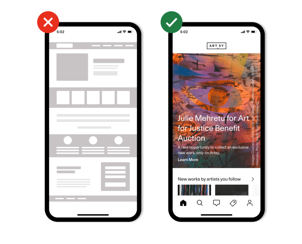
Mobile optimization is no longer just nice to have—it’s a necessity, especially for art galleries.
In recent years, consumer trends have shown a growing preference for mobile experiences, including purchases. In 2017, mobile e-commerce accounted for 59% of retail e-commerce sales. In 2021, that number is expected to reach 73%.
New studies by Artsy and Hiscox reveal that these findings are also true for art collectors. In Artsy’s “2021 Art Collector Report,” over half of the surveyed collectors said they prefer buying and discovering art on their mobile devices. And over one-third of collectors in Hiscox’s “2020 Online Art Trade Report” said they bought art on a mobile device last year.¹
We all want a simple, fast experience when we’re searching, discovering, and purchasing items on our mobile devices. But it can be hard for smaller, relationship-based businesses like art galleries to prioritize mobile optimization and know where to begin. Read on to learn why and how to optimize your gallery’s mobile presence.

View of Assembly Room. Courtesy of Kyle Knodell.
What mobile optimization is, and why it matters
Mobile optimization is a broad term to describe improving the experience of your brand and content for visitors using mobile devices. If a new collector visits your site on a mobile device and finds it slow-loading or difficult to navigate, they will likely leave before engaging with your content.
Mobile optimization also has a major impact on your gallery’s discoverability online. Google, the most dominant search engine, prioritizes mobile-friendly sites in search result rankings.
By improving your gallery’s mobile optimization, you can:
- Future proof and optimize your gallery’s digital sales and marketing strategy.
- Provide your audience with a pleasant experience, which can lead to more sales. Mobile accounts for more than half of web traffic worldwide, and visitors are five times more likely to leave websites that are not optimized for mobile.
- Direct more collectors to your gallery, artists, or artworks in search engines (regardless of whether they’re using a mobile device for their search).
- Enable more local collectors to find your gallery’s location, or provide further information to visitors who encounter your gallery in person first. (Out of all searches made through Google, 46% are seeking local information.)
Four Ways to Optimize Your Gallery for Mobile
1. Review your mobile friendliness across channels
Start your website’s mobile-optimization efforts with Google’s mobile-friendly test (you can find explanations of any issues you discover here). The test will also prompt you to view a full site usability report in the Google Search Console, which analyzes your website’s search traffic and performance overall. If your site has significant issues, you may want to consider investing in a responsive website design that dynamically adapts to different screen sizes, resolutions, and devices.
There are many cost-effective website hosts that use responsive web designs and have capabilities to adapt to galleries’ needs, such as Squarespace, WordPress, Hubspot, Format, Wix, Cargo, and ArtLogic. If you work with a web developer, you can ask them to implement Google’s guidelines for responsive web design. Avoid making a separate website just for mobile users—it’s not good for your discoverability and ranking in search results, and will create more work for you in the long run as you’ll have to maintain two websites.
A mobile-first approach is important for other key digital channels such as email and social media—over half of email recipients use a mobile device to check their inboxes. If your emails are not optimized for mobile, consider a platform that implements mobile-responsive templates and designs such as Hubspot, Mailchimp, Constant Contact, Braze, Sailthru, or Snov.io.
Social media is also becoming a major discovery channel for experienced and new collectors alike—and virtually all of Instagram’s traffic comes from mobile devices. In Hiscox’s “2020 Online Art Trade Report,” 68% of collectors said Instagram was their preferred social media platform for art, and 87% said they used it to discover new artists and find art to buy.²
Make sure your gallery’s Instagram and the links you share on it are optimized for mobile commerce and devices. Consider services like linkin.bio and linktree to direct your audience to multiple landing pages from just one link, such as a newsletter sign-up page, your online shop, and your Artsy profile. Learn more about building your social media strategy with our toolkit.
Pro tip: Artsy and mobile optimization
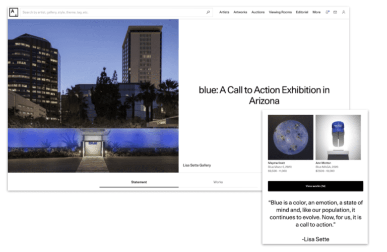
Artsy gallery partners benefit from our deep investment in mobile optimization. Artsy’s iOS and Android apps have over 1 million downloads and are designed to help collectors discover and purchase art they love. We leverage sophisticated email and push notifications, search functionalities, and rich digital experiences to keep collectors engaged—regardless of their device. See Artsy Viewing Room by Lisa Sette Gallery on mobile vs. desktop below.

2. Streamline your website’s content
More than half of your website traffic likely comes from a mobile device, and it’s important to consider the mobile user experience just as much as desktop.
Your website should make common tasks that ladder up to your gallery’s goals—such as contacting you, buying an artwork, subscribing to a newsletter, or finding a show—as easy as possible for both mobile and desktop visitors. The fewer steps you create for your audience to follow these actions, the more people you will likely convert.
Streamlining your website’s content is paramount for its performance and overall visitor experience. Having too much content with many competing calls to action will not serve your brand online—instead, it will decrease its performance and value to your gallery.
To audit your website’s content, start by opening it up on your phone as if you were a visitor and ask yourself the following questions:
Is my navigation menu easy to read?
Most people will look at your navigation menu first. Your menu should make it easy for visitors to take the actions you want them to take—such as browsing available artworks, reading about the artists you represent, signing up for your newsletter, or checking out your current exhibitions or viewing rooms. They should not have to zoom in to read it, and items on the menu should be easily clickable.
Is there content that could be distracting?
Make sure visitors can’t be distracted from taking the actions you want them to take. Remove any clutter, and ensure there are minimal steps for visitors to reach your desired outcome. The fewer steps, the more people you will convert.
Are all of my images purposeful?
Images are a big part of most gallery websites. Unfortunately, they also take up a lot of space on screens and increase loading times. Unless your images are optimized for mobile and part of a responsive web design, large images (over 2,000 pixels in height or width) will end up doing more harm than good.
3. Make it easy for collectors to buy
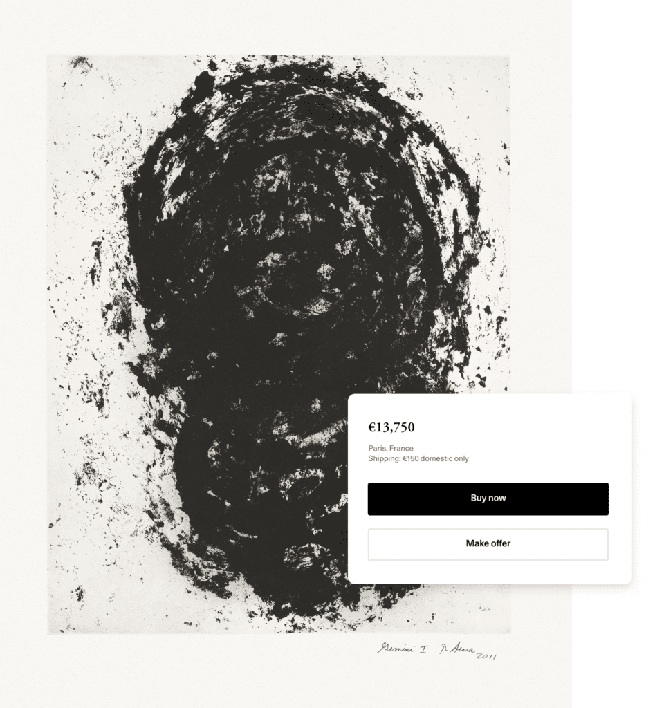
If it’s challenging to navigate around your site, potential buyers will leave. Make it easy for people to take the key actions you want by incorporating buttons, calls to action, autofill on forms, and easy checkout options such as Apple Pay, Google Pay, or PayPal.

Easy, secure purchase options on Artsy
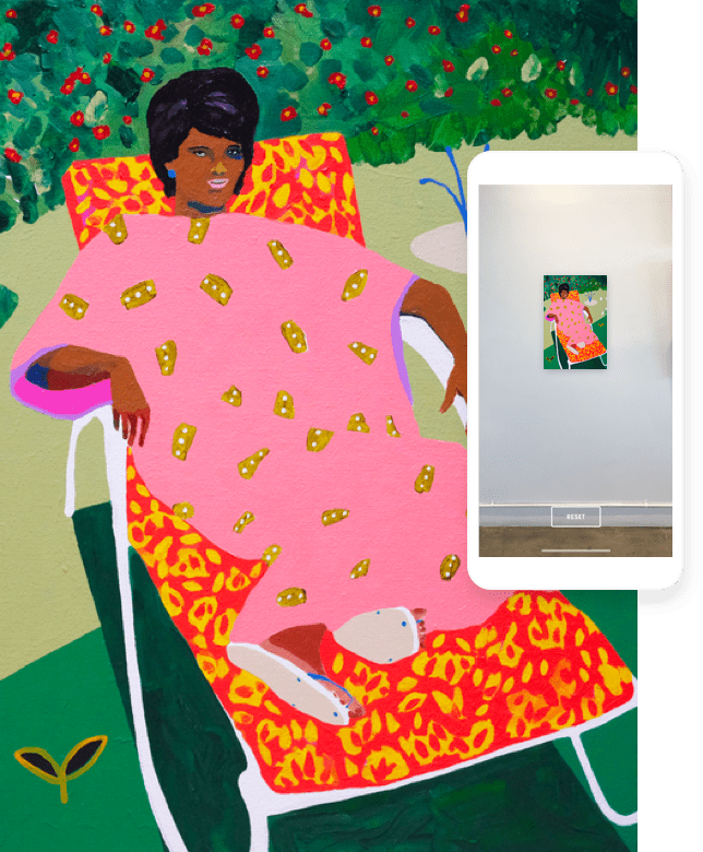
Artsy leverages easy, secure purchase options with buyer and seller protection, an augmented-reality “view in room” function, and personalized artwork recommendations to make it easy for collectors to discover and buy art they love—from any device. We keep distractions to a minimum and make sure only the most relevant information is listed across artwork, gallery, and artist pages.

Artsy’s “View in room” function
4. Speed up your website’s load times
Studies have established the negative impact that slow page load speeds can have on business goals. For example, the BBC lost an additional 10% of users for every extra second their site took to load. And according to Google, 53% of users leave sites that take longer than three seconds to load.
Images are often the culprit for slow page load speeds. Keep your gallery website’s loading speeds down by using images as intentionally as possible, and maintain dimensions under 2,000 pixels in height and width. Another way to reduce the size or weight of an image is to leverage compression tools found within Photoshop or Tiny PNG. Finally, you can decrease your website’s page load speeds by optimizing its code, leveraging browser caching, reducing redirects across your site, and using CSS Sprites.
Pro tip: Avoid inefficient file formats
If you’re looking to preserve fine detail with high resolution, use the PNG file type, but be aware that it takes up more space. If you’re looking to optimize a photo, screenshot, or similar asset, use JPEG.
Pro tip: Images and SEO
Your gallery’s strategy for web images shouldn’t stop at the size and loading speeds. Don’t forget to add keywords to your image file names, as well as “alt text” or “alt tags”—these will prioritize your site’s ranking in search results on Google. In addition, use hyphens—not underscores—in image file names. Learn more about improving your gallery’s SEO in this guide.

Conclusion
We’ve passed the tipping point of a mobile-first world. More consumers are using their mobile devices for everything digital as opposed to their desktops. By using the mobile optimization strategies we’ve outlined, you’ll deliver the best user experience to your audience, which in turn will enable them to explore your site for longer, and ultimately convert them into loyal followers and collectors.
If your gallery is looking to connect with new collectors from around the world, fill out the form below and we will be in touch. Our iOS and Android apps help thousands of galleries sell their works securely to millions of art enthusiasts and collectors.


